Visualisation: Simplicity is Power
A common pitfall that I see regularly in dashboard and visualisation design is over-complexity.
It can be a challenge for tech-savvy data scientists who know the data inside-out to produce clear, simple visualisations to get across complex messages.
There are five principles that I personally champion that I believe are central to delivering successful dashboards and visualisations. I’ll try and illustrate how I apply these principles with the example of a recent project I delivered to improve margin yield of package holidays during the peak annual sales period.
1) Know your audience
Who will be using your visualisation? Are they a manager with a strategic role, or an operational member of staff? What reports and visualisations do they currently use and like?
Go and speak to them. Have a workshop or an informal meeting. Build a relationship and listen to them.
Example: I developed a Spotfire dashboard for a team of ~20 traders. They are responsible for pricing holidays in the “earlies market” (booked a long time in advance). I spent time with key team members learning about their work and understanding their current reports.
2) Know your objective
What are you trying to achieve? What decisions will be made as a result of your visualisation?
A major challenge with visualisations is ensuring that they are effective at driving decisions. It’s all too easy to get tied up with pretty charts and forget the “so what?”. Any dashboard must bring value, rather than being yet another colourful report that gets produced, viewed once, and archived.
It therefore should have a specific decision or decisions that it will be used to make. This is a good way to frame an objective.
Example: For my project, I distilled conversations into two clear decisions that traders were making. Firstly, the selection of “focus” hotels for targeted discounting, and secondly the starting price to set going into the peak period in order to maximise seasonal margin.
N.B. Something I don’t touch on in these principles is capturing the decisions made as a result of a visualisation, to measure success. This is vital but is notoriously difficult and I don’t want to get bogged down in details here (it probably justifies its own entire post!).
3) Know your data
This isn’t specific to visualisation but is fundamental for any analytics or data science project. The task of data exploration should not be overlooked nor under-estimated. It may not feel like it is a valuable step, but it will pay dividends later on.
To help focus the exploration, you could list broad hypotheses to test or validate in the data (e.g. when price is low, bookings are high).
Example: With support from an analytics grad, I spent time understanding the trading database schema, querying and extracting key data, and exploring it. Following this we developed a simple ETL process and data quality metrics to prepare the data for visualisation.
4) Iterate, iterate, iterate
Don’t be a perfectionist. It’s important to regularly gather feedback on the useability and effectiveness of any visualisation, and to improve it rapidly. This gets the users engaged, it makes sure what you are building meets the objective, and it ensures that benefits can be reaped straight away.
At the same time, remember that your role as a consultant (or data scientist) is to provide independent critical challenge. In other words, don’t blindly do everything asked for. It’s common for people to ask for things because they “had them in the past” or because they think they “would be nice to see”. Keep asking yourself the “so what?” to ensure everything you build is relevant and supports the objective.
Example: I released an iteration of the dashboard once per week for the duration of the project (6 weeks) for the key stakeholders to play with and feedback on, as well as two major production releases for the whole team. As a result of this process we scrapped several features that I thought were great, and built several features that I hadn’t thought of.
5) Simplicity is Power
Whilst a visualisation may be extremely complex under the bonnet, it is absolutely vital that what the user sees is clear and simple to understand.
All too often I see dashboards cluttered with charts, numbers, tables, and icons. This might “look cool” or seem like the right approach, but in reality most of the time users will get overwhelmed by the complexity and lose sight of the key messages. Even if you are the user, it is wise not to get carried away, because it is almost inevitable that you will have to share your work with others further down the line.
If in doubt, keep it simple. Try to limit yourself to one or two charts per page, and limit your dashboard to as few pages as possible. Avoid acronyms, and have large, clear legends and titles. Make sure you include links to data definitions or page explanations (I tend to embed this in the dashboard itself with a “definitions” page). Only show filters that are useful and make sure their names make sense.
Two good tricks for ensuring simplicity whilst retaining the ability to understand complexity are to include user-configurable axis, and to semi-automate the analysis to highlight important things.
By user-configurable axis, I am referring to the ability to use the same visualisation to cut data in different ways depending on what the user selects. So for example, in the trading dashboard the user could select whether they want to see data at an individual hotel level, at an arrival airport level, by hotel star rating, by product type, by country, etc. etc. (or a combination of these things).
By semi-automation of analysis, I am referring to categorising data depending on values to quickly flag things that will help the user make their decision. A simple example of this is a traffic light (RAG status). If a value is less than x, then the row is red, and if it’s greater than y, then the row is green. By building a rule like this (or several layers of rules), it is possible to filter or sort to show the information that is of most value to support the user’s decision.
In the trading dashboard, I built a categorisation that highlighted sudden drops or increases in bookings or margin in historical data. This allowed the users to very quickly spot hotels that in previous years had under-performed (or over-performed), and learn lessons to apply to their pricing decisions this year.
I’ve explained some of the technical details of these techniques in the appendix below.
I hope my ideas have been useful. By following these principles, I was ultimately awarded the accolade of “Trader of the Week”, usually reserved for members of the trading team itself. This was a lovely way to finish the project and fantastic to know that my visualisation was valuable!

Technical Appendix
Types of Visualisation
In my view, there are two key types of visualisation.
- Visualisation as a report
- Simply shows data
- Semi-static views
- Can replace basic legacy reporting
- Can be exported to a pdf and emailed to a director
- Not configurable, basic filtering only
- Visualisation as a tool
- Interactive
- Dynamic views: different users can explore data in different ways
- Not suitable for exporting or periodic static reporting
- Drill-downs and analytical capabilities: Ability to answer wide range of questions
This post is referring to 2) visualisation as a tool.
Setting up a user-configurable axis
The way to do this will differ depending on the software you’re using. In Spotfire, you need to add a document property and a calculated column. In Tableau, you need to add a parameter and a calculated field. The concept is the same in both cases: the parameter holds the user input (which can be modified via a drop-down or other user input), and the calculated column looks at the value of this parameter, and sets the relevant value accordingly.
So, for example, you could make the parameter settable by the user to “Continent”, “Country”, or “City” (depending on what fields your data holds).
And the calculated column might look something like this:
CASE
WHEN [Parameter] = “Continent” THEN [Continent]
WHEN [Parameter] = “Country” Then [Country]
WHEN [Parameter] = “City” Then [City]
ELSE “All Rows”
END
When this calculated column is added to the axis of a visualisation, suddenly the user has the power to (very simply) change what they’re looking at. When they set “Continent”, they might see that sales in Europe are A and sales in Asia are B. On the same visualisation, when they set “Country”, they might see that sales in the UK are C and sales in Ireland are D.
You can use this trick for values as well. So suddenly the user could look at various combinations by setting “Average Sales”, “Total Sales”, or “Total Customers” on the Y axis, for example.
Using this trick in conjunction with “Colour by” or “Line by” features can take it further still. You could allow the user to colour bars based on a category which would allow them to show which cities have the most customers within each country, for example.
This gives a lot of flexibility in a single visualisation, ensuring simplicity does not sacrifice power.
Semi-automation of analysis in a visualisation
There are many different ways of doing this, and there is no “right answer”. Often the most challenging aspect of this task is to establish what exactly it is that should be flagged to the user (i.e. what is “good” and what is “bad”? How do I define anomalies in my data?). This typically requires comprehensive data exploration as well as discussions with users (principles 1 and 3 above).
In most cases it is wise to allow the user to tweak their definition of “good” or “bad” in the dashboard itself, using a parameter (“Document Property” in Spotfire). So, for example, a parameter called “redThreshold” might be set to 80% to indicate the level below which is “bad”. Adding a calculated column, I could say something like:
IF [ValueField] < {redThreshold} THEN “Red” ELSE “Green” END
Then in the visualisation itself, I can use this calculated field to colour a row, to sort or filter data, or on an axis. I could then bring all of my poorly performing rows to the top of the list, for example.
Adding an input box to set the parameter would give the flexibility for the user to tweak the value if required.
This is a very simple example (and probably unnecessary). In reality this technique will typically need to be applied with various layered rules or categories. In practice what this will mean is writing more complex calculated columns.
Here’s an example from the trading dashboard:
CASE
WHEN [TOY_POSTTOY_MPP_PERCENTILE_VARIANCE] >= ${ExtremeMarginIncrease} THEN "Extreme Increase MPP"
WHEN [TOY_POSTTOY_MPP_PERCENTILE_VARIANCE] <= ${ExtremeMarginDecrease} THEN "Extreme Decrease MPP"
WHEN [TOY_POSTTOY_MPP_PERCENTILE_VARIANCE] < ${ExtremeMarginIncrease} AND [TOY_POSTTOY_MPP_PERCENTILE_VARIANCE] > ${ExtremeMarginDecrease} THEN "OK"
WHEN [TOY_POSTTOY_MPP_PERCENTILE_VARIANCE] IS NULL THEN "No Value (no bookings)"
ELSE "No Value"
END
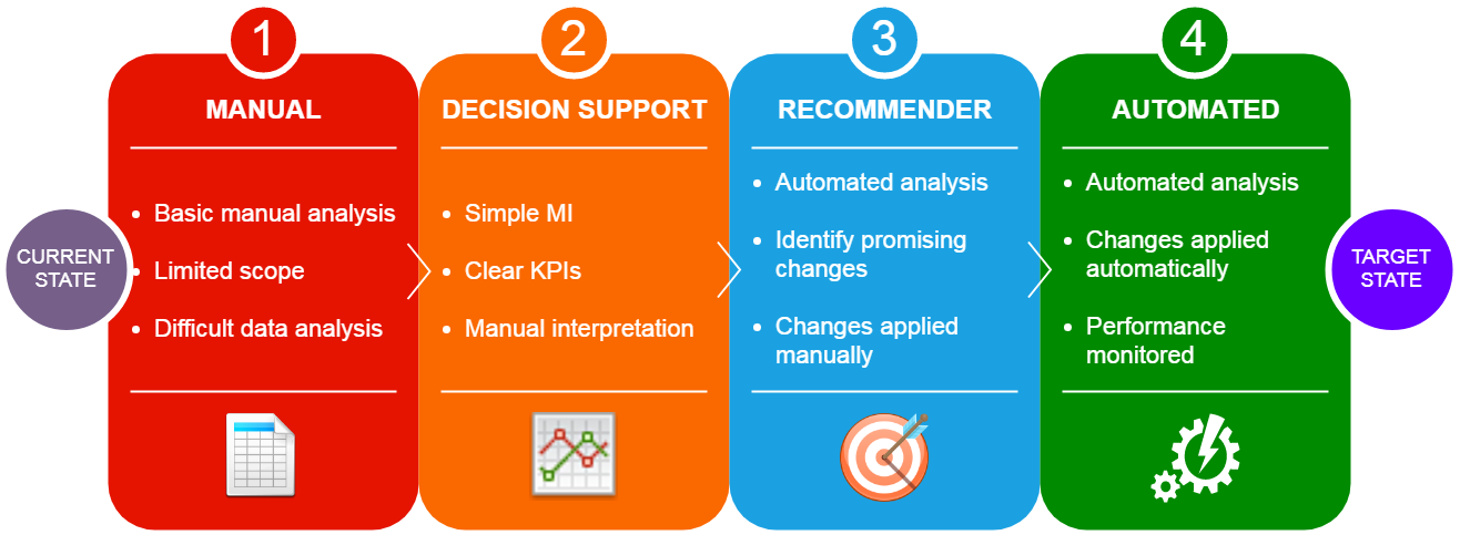
Even this example is probably too straightforward for most use cases, but it hopefully demonstrates the principle (it actually only worked like this because of some canny column calculations during ETL). As you can imagine, getting creative with this can take your dashboard from a flat “here is some data” to an incredibly useful “here is some data and you need to do something this part”. The value of the visualisation becomes the decision support, rather than simply a “dashboard”.
I won’t go into detail about the next step of this ladder other than to say that you should aspire to use visualisation tools as windows into more complex data science techniques. In other words, “here is some data, you need to do something about this part, and this is what you should do”.
To summarise this point, here is a slide I created as part of the project that I think encapsulates the idea of visualisation evolution into more advanced analysis and models: